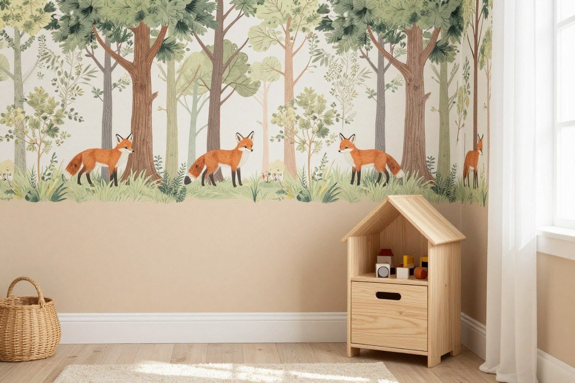
The half wallpaper half paint trend transforms ordinary rooms into stunning design statements. This versatile wall treatment combines the texture and pattern of wallpaper with the simplicity of paint.Creating visual interest without overwhelming your space is easier than you think. The technique works in any room of your home.
Whether you prefer bold contrasts or subtle harmonies, there’s a combination that matches your style. This guide showcases twenty inspiring ways to use this design approach.
Table of Contents
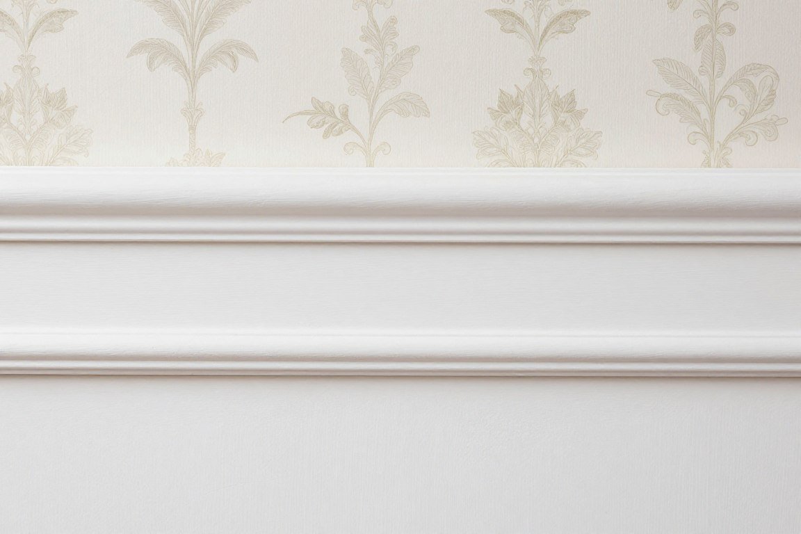
Classic Dado Rail Elegance
The traditional dado rail provides a natural division point for combining wallpaper and paint. This timeless approach adds architectural interest to any room.
Position your wallpaper above the rail and paint below for a classic look. The dado rail creates a clean line that eliminates the need for perfect measuring.
Period homes particularly benefit from this style. The technique respects original architectural features while adding contemporary colour choices.
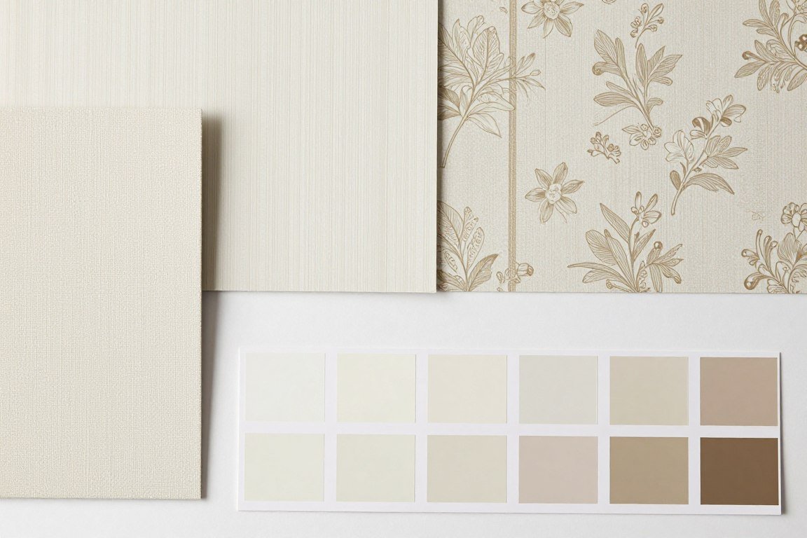
Upper Section Options
- Delicate floral patterns for feminine spaces
- Geometric designs for modern aesthetics
- Textured wallpapers for depth
- Subtle damask for formal rooms
Lower Section Paint Choices
- Deep jewel tones for drama
- Neutral shades for versatility
- Darker colour than wallpaper background
- Matte finish for sophistication
Modern Horizontal Split

Breaking convention by placing wallpaper on the lower portion creates unexpected visual interest. This contemporary approach works brilliantly in modern homes.
The technique draws the eye downward, making rooms feel more grounded. It’s particularly effective in spaces with high ceilings.
Painting the upper section in a lighter shade keeps the room feeling open. The wallpaper anchors furniture and creates a distinctive backdrop.
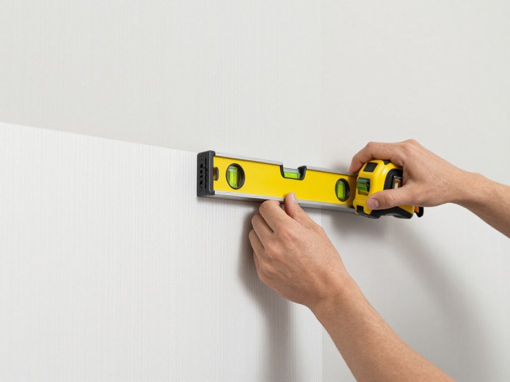
Measurement Guidelines
Determining the right height for your split is crucial to achieving balance in your space. Consider both the room’s proportions and its function.
- Measure from the floor to identify your desired height point
- Mark a level line using a laser level or traditional spirit level
- Apply masking tape along the line for clean edges
- Complete the wallpaper application first, then paint above
- Remove tape carefully while paint is slightly damp

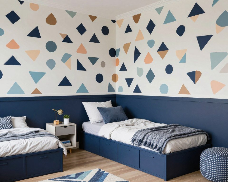
Nursery Whimsy
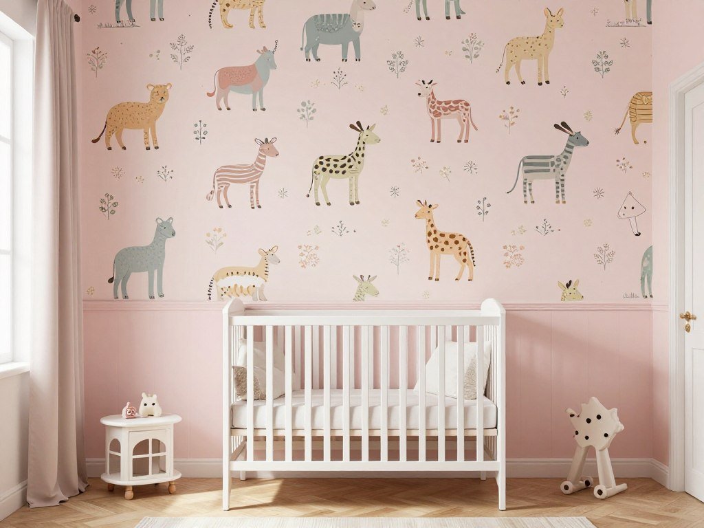
Children’s rooms offer the perfect opportunity for creative wallpaper and paint combinations. The half wall approach prevents patterns from overwhelming small spaces.
Playful wallpaper on the upper section captures imagination without making the room feel chaotic. Softer paint colours below create a calming foundation.
This design strategy grows with your child. Simply change the wallpaper as their interests evolve while keeping the painted portion.
Colour Combinations for Children’s Rooms
Calming Schemes
Soft patterns in blues or greens paired with cream or white paint create peaceful environments that promote rest and relaxation.
Energetic Choices
Bright, bold wallpaper with primary colours above vibrant painted sections encourage play and creativity during active time.
Neutral Foundations
Gentle patterned wallpaper with neutral paint allows easy updates as your child grows without complete redecoration.

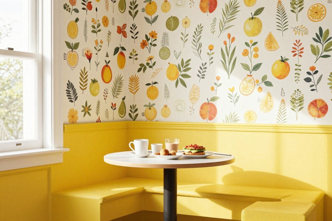
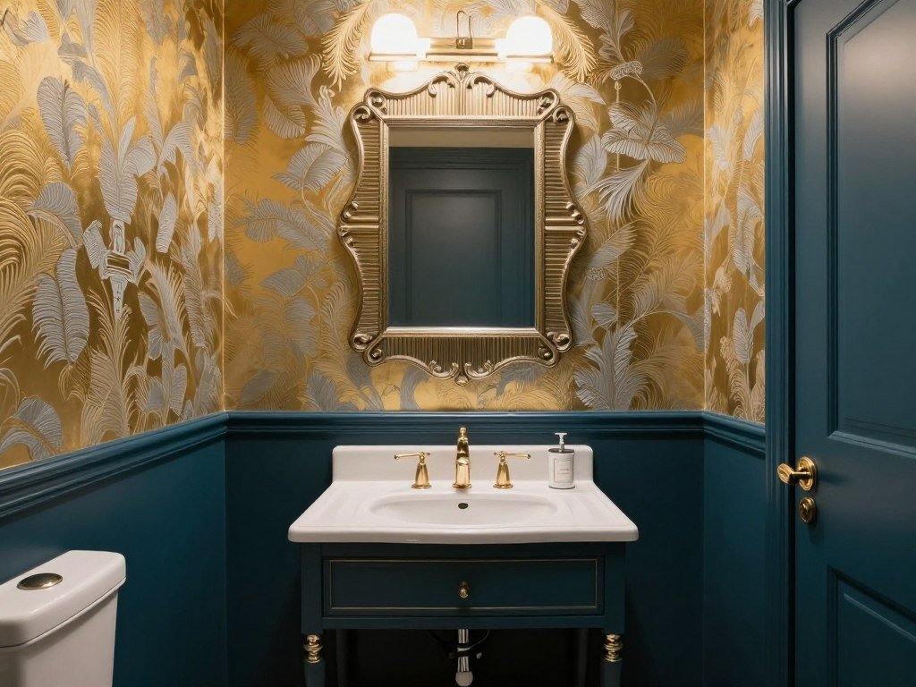
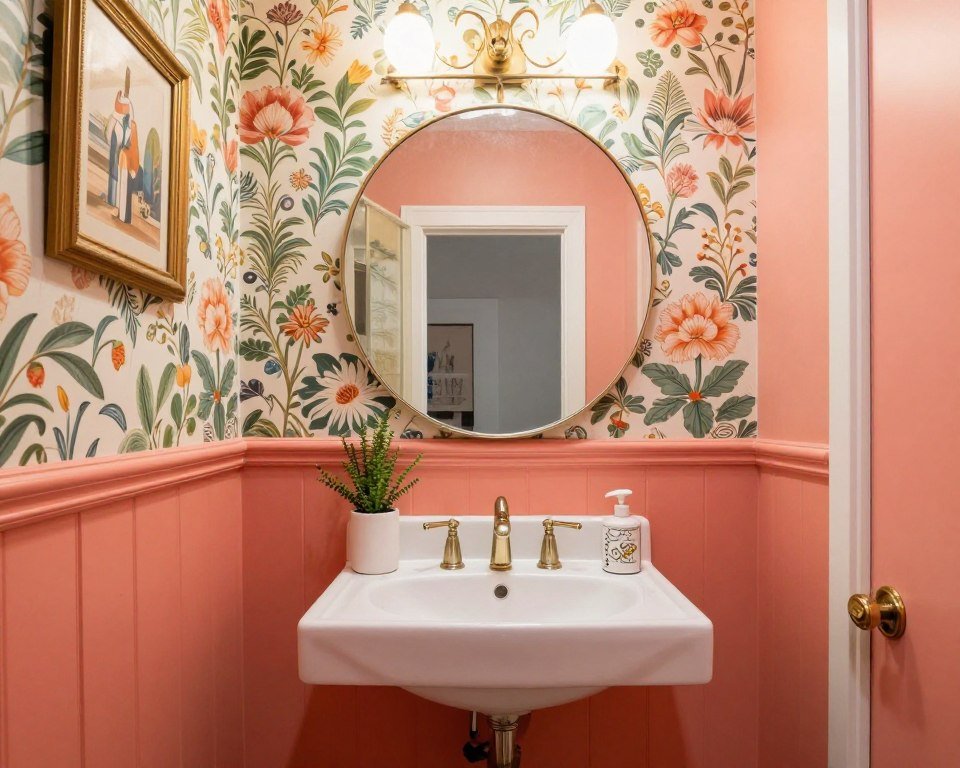
Bathroom Luxury
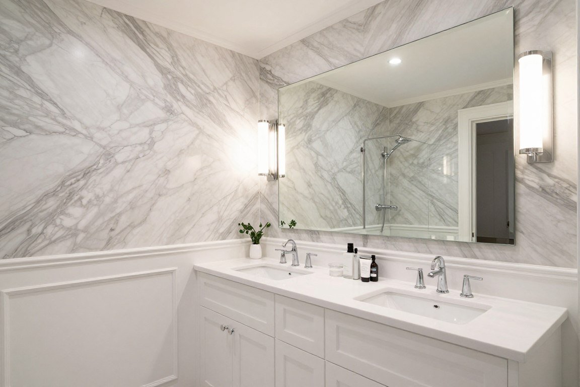
Bathrooms present unique opportunities for the half wall design approach. Moisture-resistant wallpaper on the upper section adds luxury without practical concerns.
The painted lower portion in a darker colour disguises splashes and wear. This practical choice maintains a fresh appearance over time.
Using wallpaper above the splash zone protects your investment while creating visual impact. The combination feels both elegant and sensible.
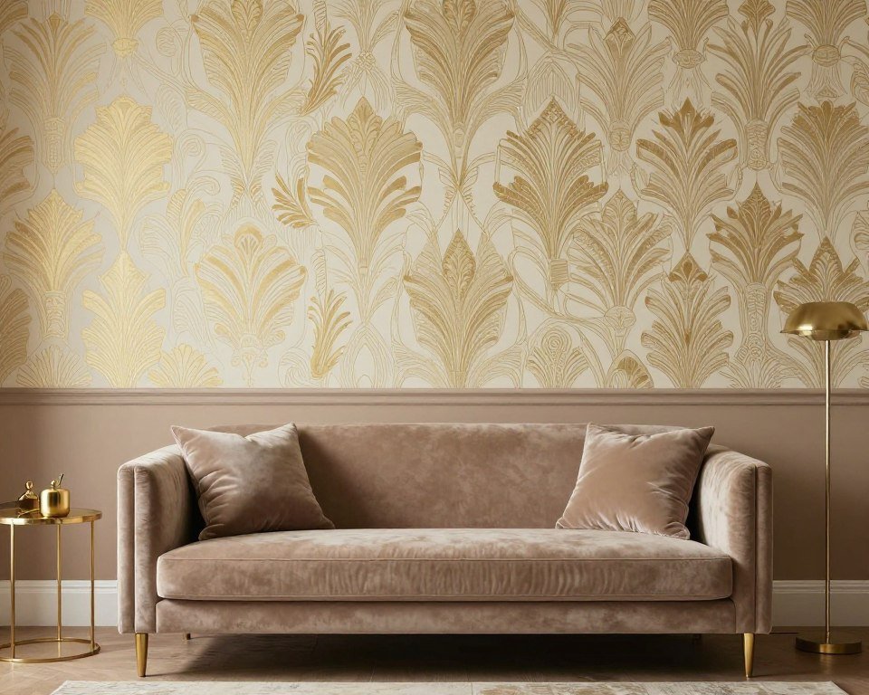
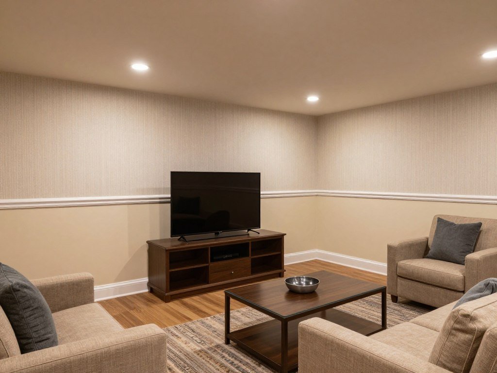
Living Room Drama

Create a focal point in your living space by using bold wallpaper above painted walls. This approach adds personality without overwhelming the entire room.
Metallic or textured wallpapers catch light beautifully when positioned on the upper wall. The painted section grounds the space and complements your furniture.
Consider the height of your seating when planning the division line. The wallpaper should create a backdrop for your living area without competing with it.
Style Variations for Living Spaces
Traditional Elegance
Classic damask or toile wallpapers pair beautifully with rich paint colours for timeless sophistication in formal living rooms.
- Damask patterns in neutral tones
- Deep burgundy or forest green paint
- Gold or silver metallic accents
- Coordinating crown molding
Contemporary Chic
Geometric wallpapers above clean paint lines create modern statements that feel current and fresh in casual living areas.
- Abstract geometric patterns
- Monochromatic colour schemes
- Matte paint finishes
- Minimal decorative elements
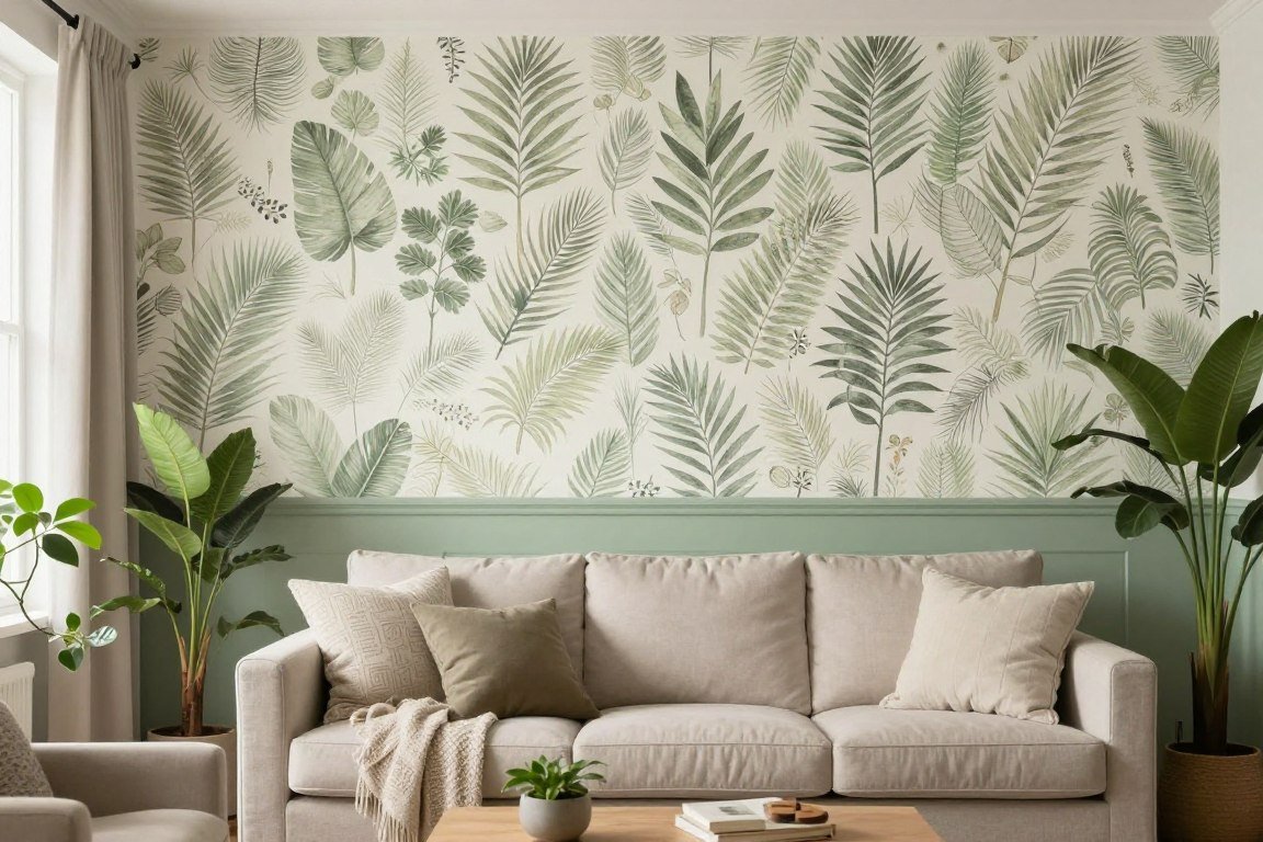
Eclectic Mix
Bold patterned wallpapers combined with unexpected paint colours express personality and create conversation-starting spaces.
- Tropical or botanical prints
- Jewel-tone paint selections
- Mixed metal accessories
- Layered textures throughout
Minimalist Approach
Subtle textured wallpapers with neutral paints maintain simplicity while adding depth and interest to understated interiors.
- Grasscloth or linen textures
- White, gray, or beige palettes
- Natural material furniture
- Uncluttered visual flow
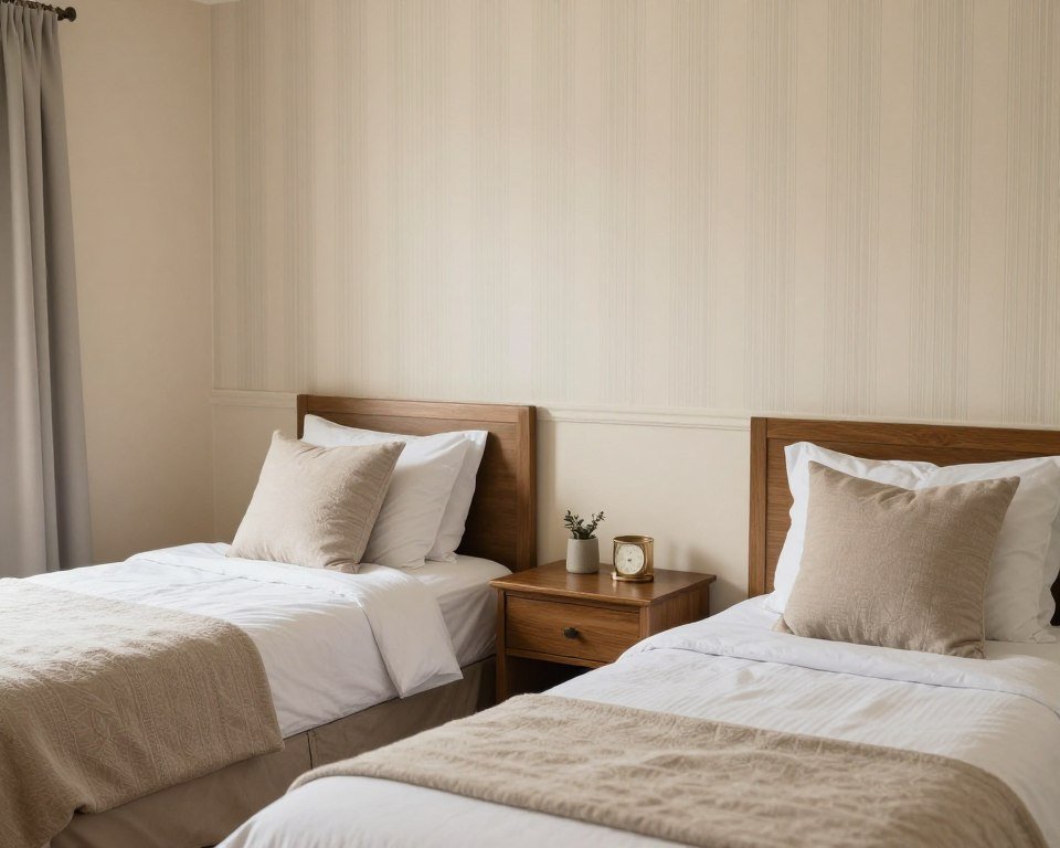
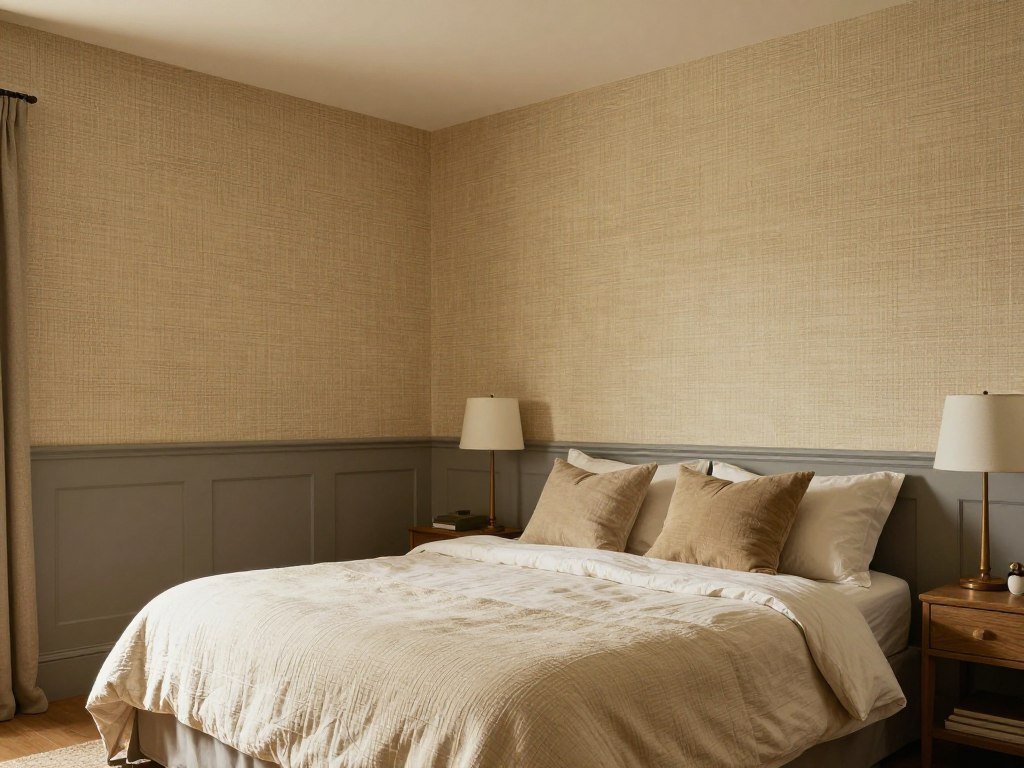
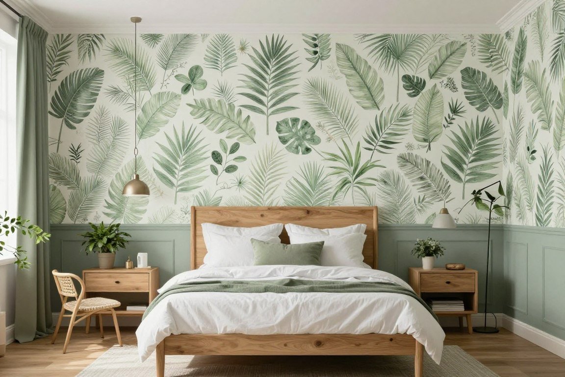
Bedroom Serenity

Bedrooms benefit from the calming effect of thoughtfully combined wallpaper and paint. The half wall technique creates interest without disrupting restful energy.
Positioning wallpaper behind your bed creates a headboard effect. The painted portion below reduces visual noise and promotes relaxation.
Lighter colours on both sections maintain an airy feel essential for quality sleep. Soft patterns work better than busy designs in this intimate space.
Creating Balance in Bedrooms
The key to successful bedroom design lies in balancing visual interest with tranquility. Your wall treatment sets the tone for the entire space.
- Choose wallpaper patterns with calm, flowing designs rather than sharp geometric shapes
- Select paint colours one or two shades darker than the wallpaper background for subtle contrast
- Position the division line at mattress height to create a natural visual anchor
- Consider how the design looks from your bed, your primary viewing angle
- Test samples in morning and evening light before committing to final choices
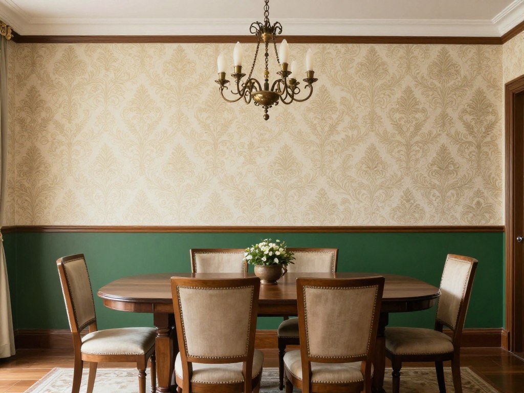
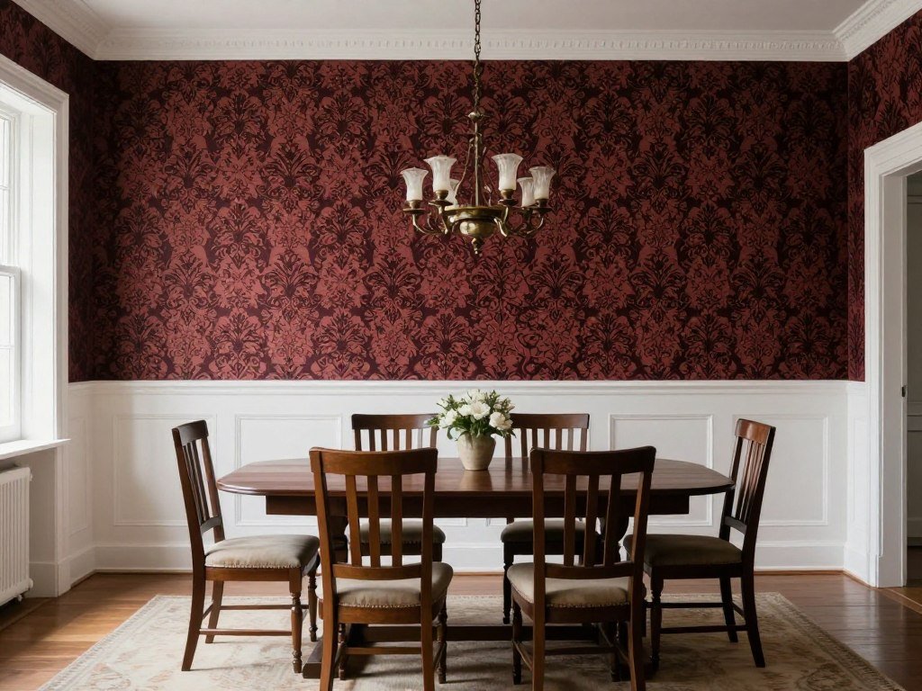
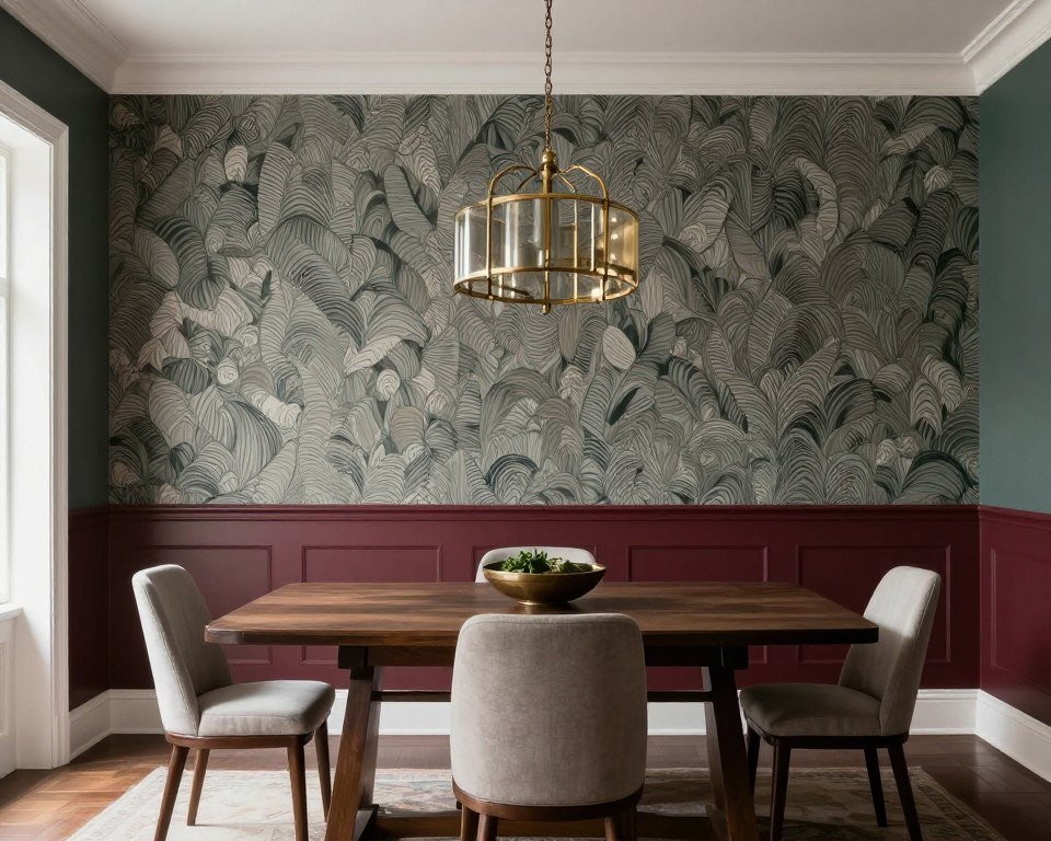
Dining Room Sophistication
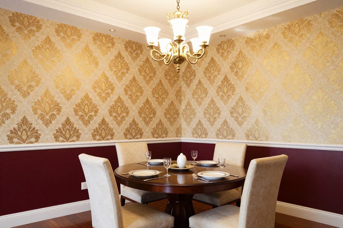
Dining rooms are ideal spaces for bolder wallpaper choices. The half wall approach allows you to use dramatic patterns without overwhelming guests.
Rich, deep paint colours on the lower section add formality appropriate for dining spaces. This combination creates an elegant backdrop for meals and gatherings.
The technique also provides practical benefits. Darker paint hides chair scuffs and maintains a pristine appearance over time.

Pro Tip: In dining rooms, position your division line approximately 32-36 inches from the floor. This height protects walls from chair damage while creating visually pleasing proportions.
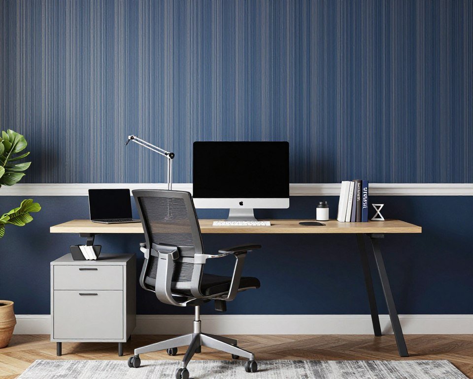
Home Office Focus

Home offices require designs that enhance concentration without creating distraction. The half wallpaper half paint approach achieves this balance perfectly.
Positioning wallpaper above your desk creates visual interest at eye level. The lower painted section remains simple, allowing you to focus on work.
Choose patterns that energize without overwhelming. Your workspace should inspire productivity while maintaining professional aesthetics.
Colour Psychology for Workspaces
Energizing Combinations
- Yellow wallpaper with gray paint stimulates creativity
- Orange accents with cream promote enthusiasm
- Bright patterns with neutral paint increase energy
- Warm tones encourage active thinking
Calming Combinations
- Blue wallpaper with white paint reduces stress
- Green tones with beige promote concentration
- Soft patterns with cool paint improve focus
- Neutral schemes minimize distraction
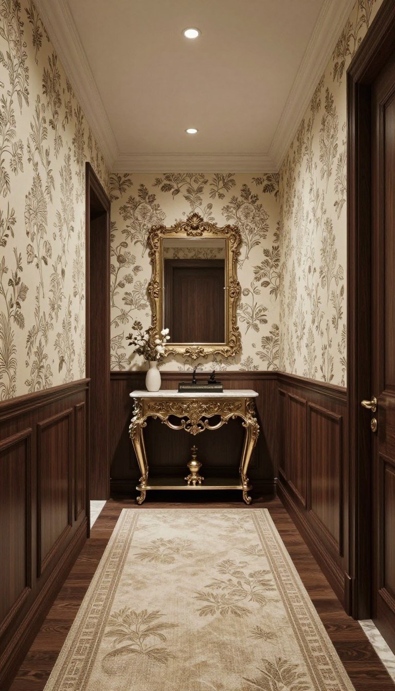
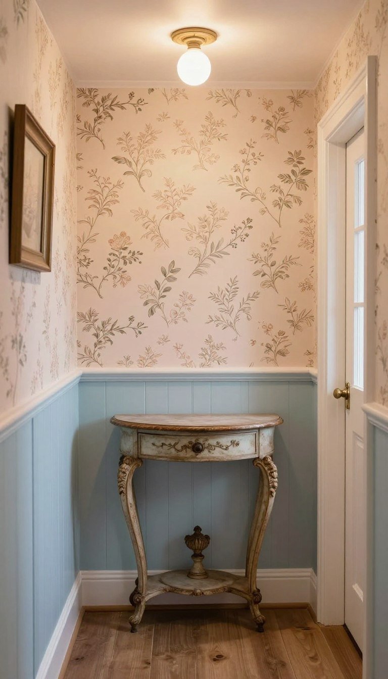
Hallway Impact
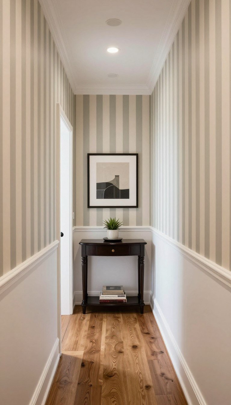
Hallways often feel overlooked in design schemes. The half wall treatment transforms these transitional spaces into memorable design moments.
Vertical patterns on the upper section make low ceilings feel taller. White or light paint below keeps narrow halls feeling spacious.
This approach also addresses practical concerns. Lower painted walls withstand traffic better than wallpaper in high-use areas.
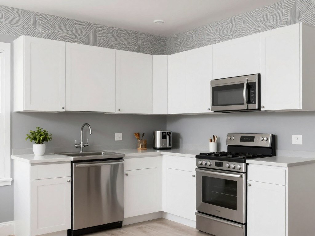
Kitchen Personality

Kitchens benefit from wallpaper that adds personality above the backsplash area. The painted lower section withstands cooking splashes and daily wear.
Washable wallpaper in the upper zone introduces pattern without maintenance concerns. This combination brings life to an often purely functional space.
Consider the style of your cabinets when selecting patterns. The wall treatment should complement rather than compete with existing elements.
Practical Kitchen Considerations
| Wall Section | Best Material | Maintenance Level | Design Impact |
| Upper Wall | Vinyl or washable wallpaper | Low – wipe clean as needed | High – main visual focus |
| Lower Wall | Satin or semi-gloss paint | Very low – easy touch-ups | Medium – grounds the design |
| Behind Stove | Tile backsplash only | Low – heat resistant | Coordinating accent |
Basement Brightening

Basements often suffer from limited natural light. Strategic wallpaper and paint combinations counteract darkness and create inviting spaces.
Light-coloured wallpaper with reflective qualities brightens upper walls. White or very pale paint below maximizes light reflection throughout the room.
This technique makes basement rooms feel less cave-like. The visual interest prevents the space from feeling boring despite the lighter palette.
Maximizing Light in Lower Levels
- Select wallpaper with metallic threads or silk finishes that catch available light
- Use the lightest paint shade possible on the lower wall to reflect light upward
- Position the division line lower than usual to maximize the bright painted area
- Choose wallpaper patterns with white or light backgrounds rather than dark ones
- Add strategic lighting above the wallpaper section to highlight texture and pattern
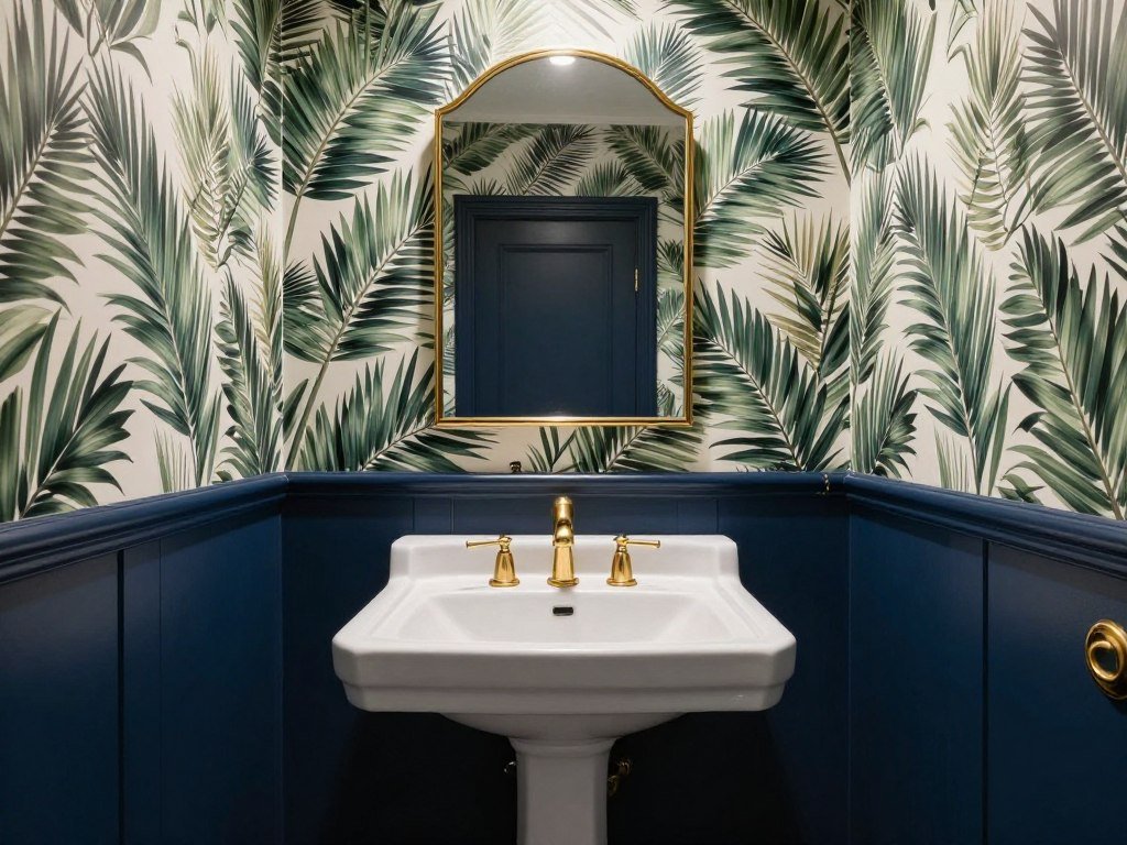
Powder Room Boldness
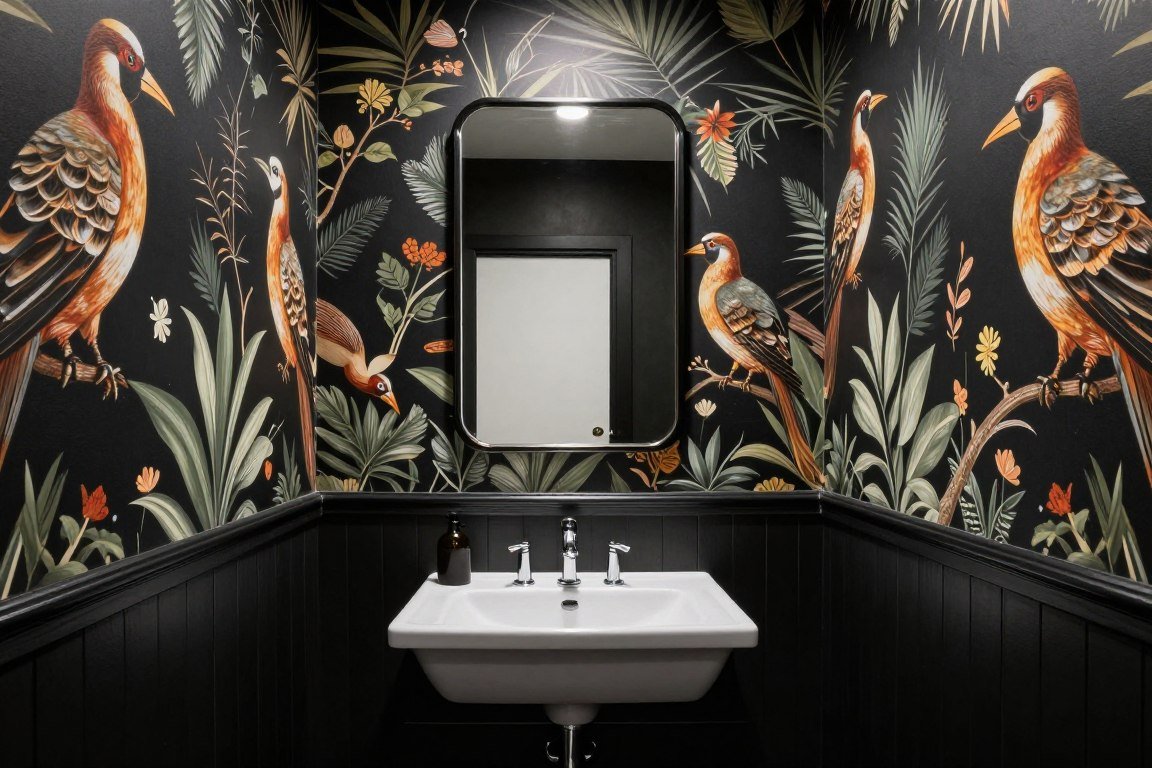
Powder rooms provide the perfect opportunity for design risks. The small space allows bold wallpaper choices that would overwhelm larger rooms.
Dramatic patterns paired with equally strong paint colours create memorable guest experiences. This is your space to experiment without hesitation.
The half wall approach prevents even the boldest combinations from feeling claustrophobic. It maintains breathing room while delivering maximum impact.
Design Caution: In very small powder rooms under 20 square feet, consider placing the darker paint on top and lighter wallpaper below to prevent the space from feeling bottom-heavy.
Panelling Integration

Combining wallpaper with decorative panelling creates architectural depth. The painted panelling provides texture while the wallpaper adds pattern and colour.
This approach works beautifully in period homes where panelling feels authentic. Modern interpretations suit contemporary spaces equally well.
The panelling protects walls from damage in high-traffic areas. It’s both beautiful and practical for busy family homes.
Panelling Styles to Consider
Board and Batten
Vertical boards create clean lines that pair beautifully with any wallpaper style. Paint in white or contrast colours for different effects.
Shaker Style
Simple recessed panels offer understated elegance. This timeless choice works in both traditional and modern homes with various wallpapers.
Picture Frame
Decorative molding creates defined sections. Fill with paint or leave raised for texture beneath patterned or textured wallpaper above.
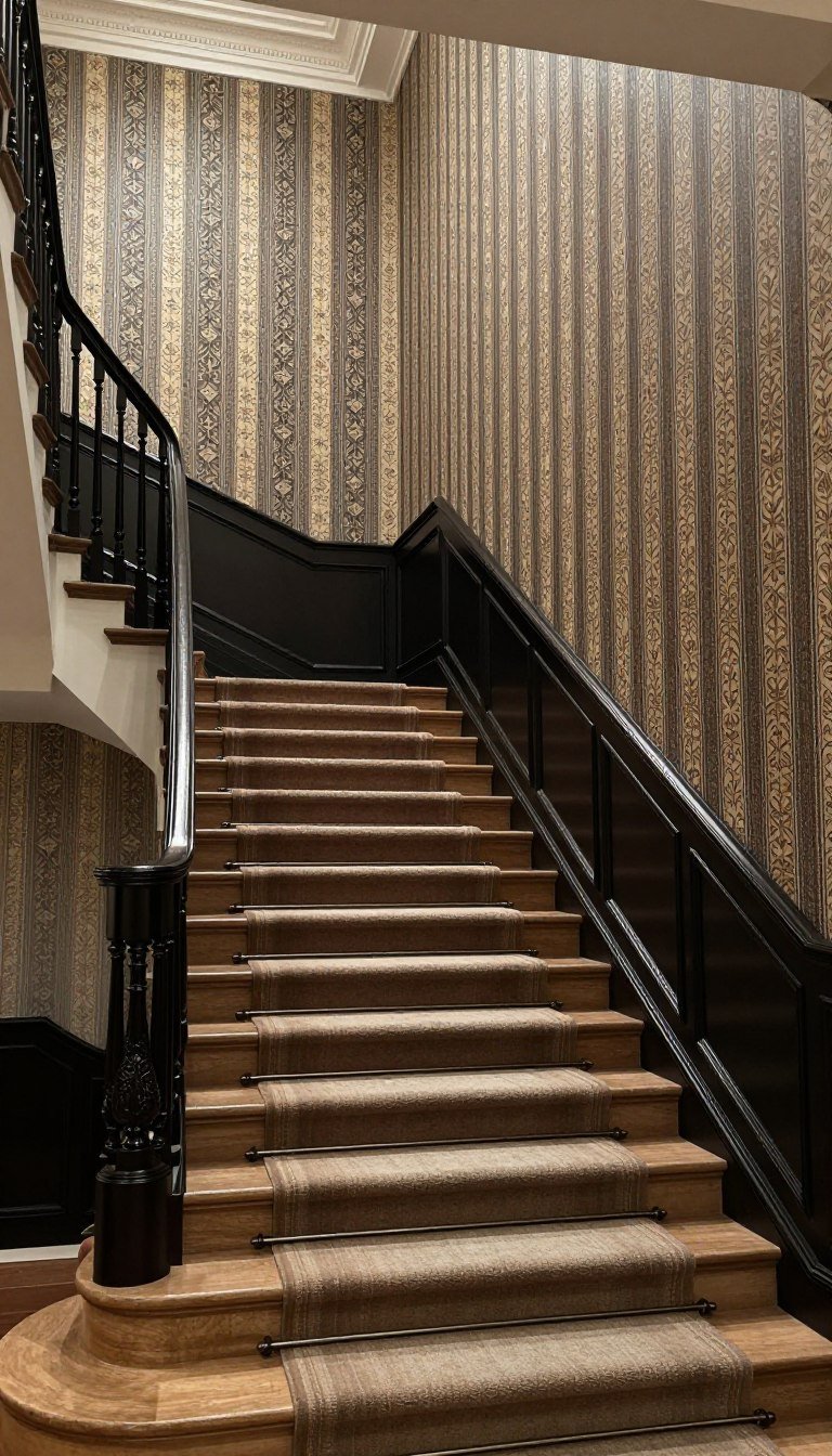
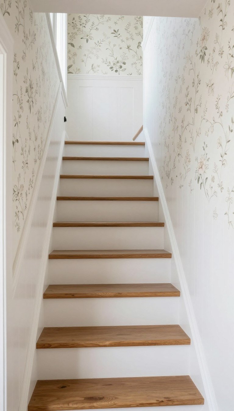
Stairway Journey
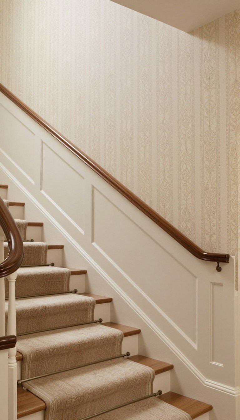
Stairways present unique design challenges with angled walls and vertical space. The half wall technique adapts beautifully to these areas.
Following the stair angle with your division line creates visual flow. The wallpaper draws the eye upward while paint grounds the lower section.
This approach also addresses wear patterns. The painted area protects walls where hands touch the surface for balance.
Installing on Angled Walls
Working with stairway walls requires careful planning and execution. The angled nature creates unique considerations for both wallpapering and painting.
- Mark your division line following the stair angle rather than horizontally for visual harmony
- Start wallpaper installation from the bottom of the stairs working upward for easier pattern matching
- Use a plumb line to ensure wallpaper remains straight despite the angled division
- Apply extra adhesive at corners where angles change to prevent lifting over time
- Choose wallpaper patterns that work well when viewed from multiple angles and distances
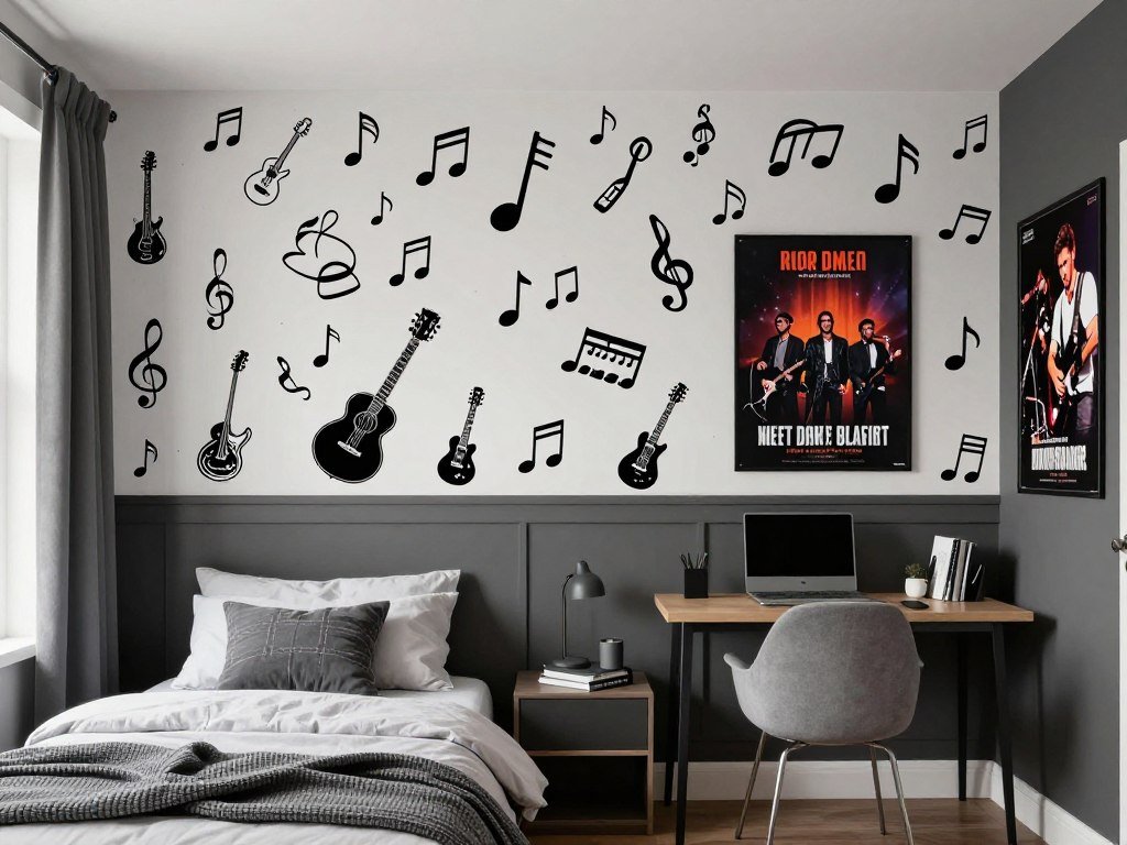
Teen Bedroom Expression

Teen bedrooms require designs that reflect evolving personalities. The half wallpaper half paint approach allows self-expression without permanent commitment.
Bold wallpaper choices feel age-appropriate while the painted section can update easily. This flexibility matters as tastes change rapidly during teenage years.
Involving teens in the selection process creates ownership of their space. The design becomes a reflection of their current interests and style.
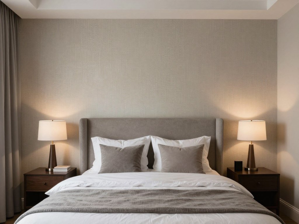
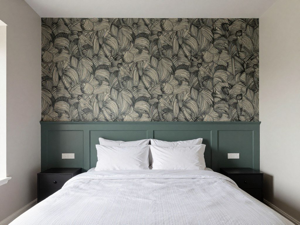
Master Suite Luxury

Master bedrooms deserve the same design attention as public spaces. The half wall treatment adds sophistication while maintaining the calm necessary for rest.
Textured wallpapers in neutral tones create subtle luxury. Complementary paint in slightly deeper shades adds depth without overwhelming the senses.
This design approach frames the bed beautifully. It creates a hotel-like atmosphere that feels special every day.
Creating a Spa-Like Retreat
Calming Elements
- Neutral wallpaper with subtle texture
- Soft blue or green paint tones
- Natural material patterns
- Matte paint finishes
- Organic, flowing wallpaper designs
Luxury Touches
- Metallic accent wallpapers
- Rich jewel-tone paints
- Silk or velvet textures
- Sophisticated pattern scales
- Hotel-inspired color palettes
Personal Expression
- Favorite color combinations
- Meaningful pattern choices
- Cultural design influences
- Travel-inspired motifs
- Collected art coordination
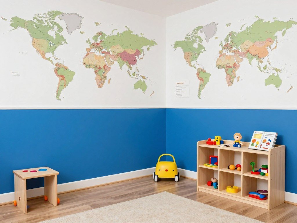
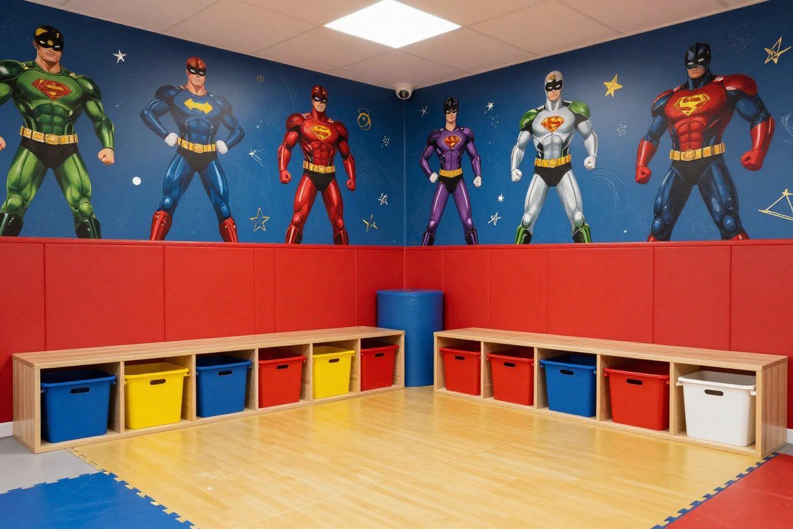
Playroom Practicality

Playrooms need designs that withstand active use while stimulating young minds. The half wall approach delivers both durability and visual interest.
Educational or whimsical wallpaper on the upper section engages children during play. Washable paint below handles inevitable marks and fingerprints.
This practical combination grows with your children. Update the wallpaper as they age while keeping the painted foundation.
Durability Considerations
| Surface | Recommended Finish | Cleanability | Durability Rating |
| Upper Wallpaper | Vinyl coated or washable | Wipe with damp cloth | High – resists tearing |
| Lower Paint | Semi-gloss or satin | Scrub with soap and water | Very high – easy touch-ups |
| Division Line | Chair rail molding optional | Dust regularly | Protects edges from damage |
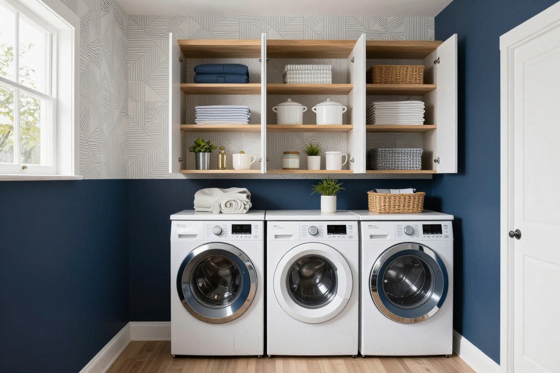
Laundry Room Cheer
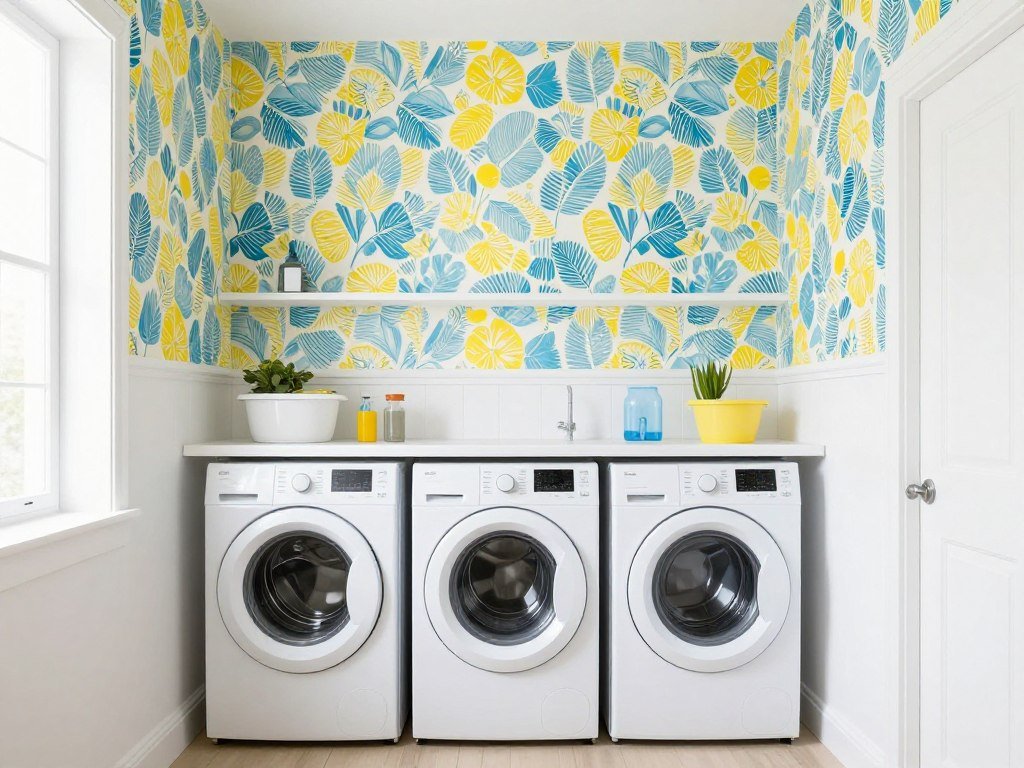
Laundry rooms often get neglected in design plans. The half wallpaper half paint technique transforms this utilitarian space into something enjoyable.
Cheerful patterns make the chore feel less tedious. Practical paint on the lower section withstands detergent splashes and daily wear.
This small investment in design improves your daily experience. Even mundane tasks feel better in attractive surroundings.
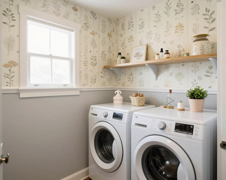
Moisture-Resistant Choices
- Select vinyl wallpapers specifically rated for high-moisture areas to prevent peeling
- Use mildew-resistant paint formulated for bathrooms and utility rooms on lower walls
- Ensure proper ventilation with exhaust fans to prevent moisture accumulation
- Apply wallpaper adhesive appropriate for humid conditions for long-lasting adhesion
- Consider semi-gloss paint finish on lower section for easy wipe-down of spills
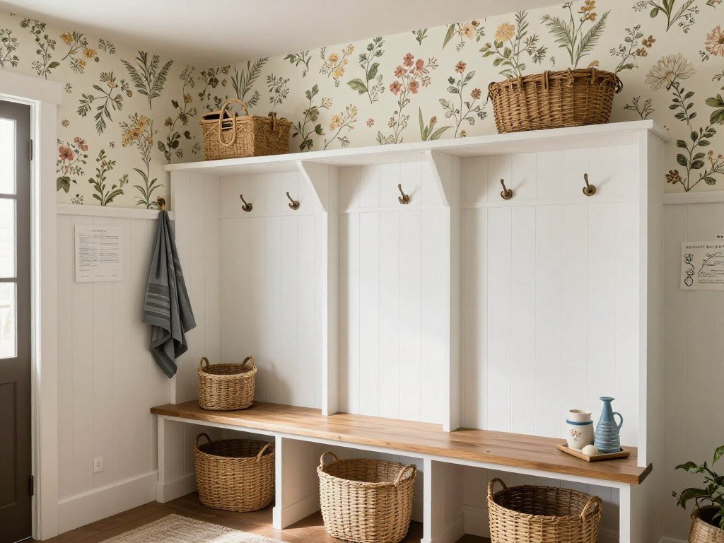
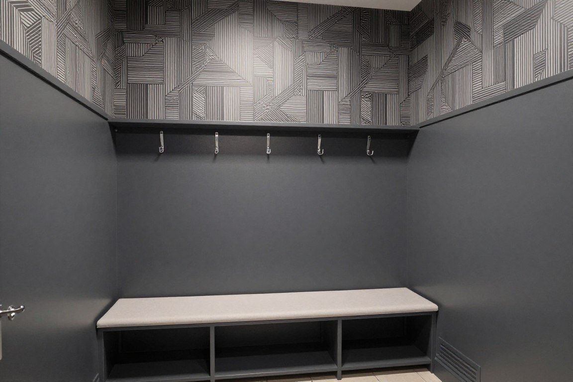
Mudroom Welcome

Mudrooms endure heavy traffic and daily abuse. The half wall design balances durability with welcoming aesthetics.
Wallpaper on the upper section stays clean while adding personality. Dark or medium-toned paint below hides scuffs from shoes, bags, and sports equipment.
This approach makes the transition space feel intentional rather than merely functional. It sets a positive tone as you enter your home.
High-Traffic Solutions
Best Practices
- Use scrubbable wallpaper in upper section
- Choose darker paint colours to hide marks
- Install protective chair rail at division line
- Select patterns that camouflage minor damage
- Apply extra coats of paint for durability
Avoid These Mistakes
- Light-colored paint on lower walls
- Delicate wallpaper in high-touch areas
- Complex patterns difficult to match for repairs
- Matte paint finish that shows every mark
- Expensive wallpaper in damage-prone zones
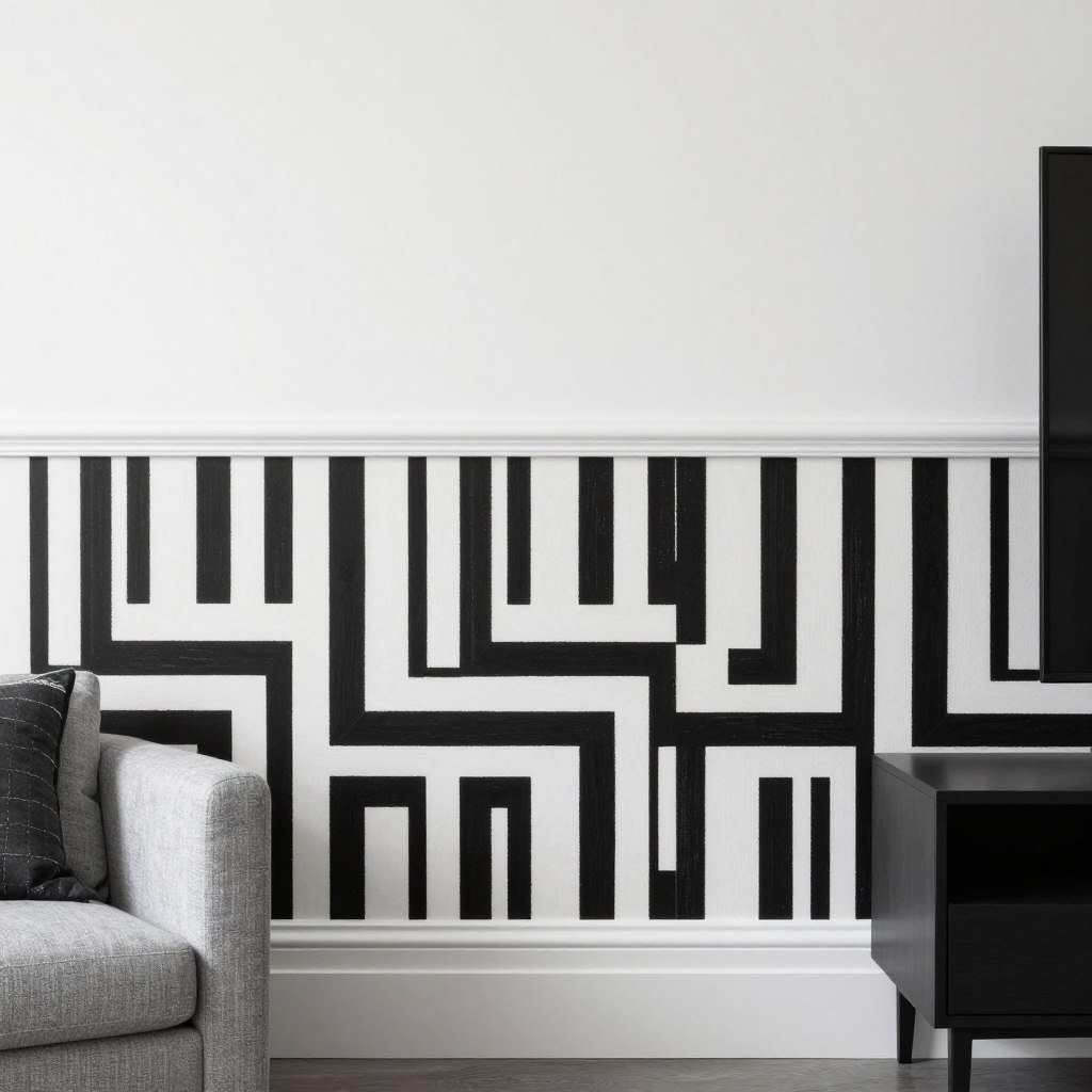
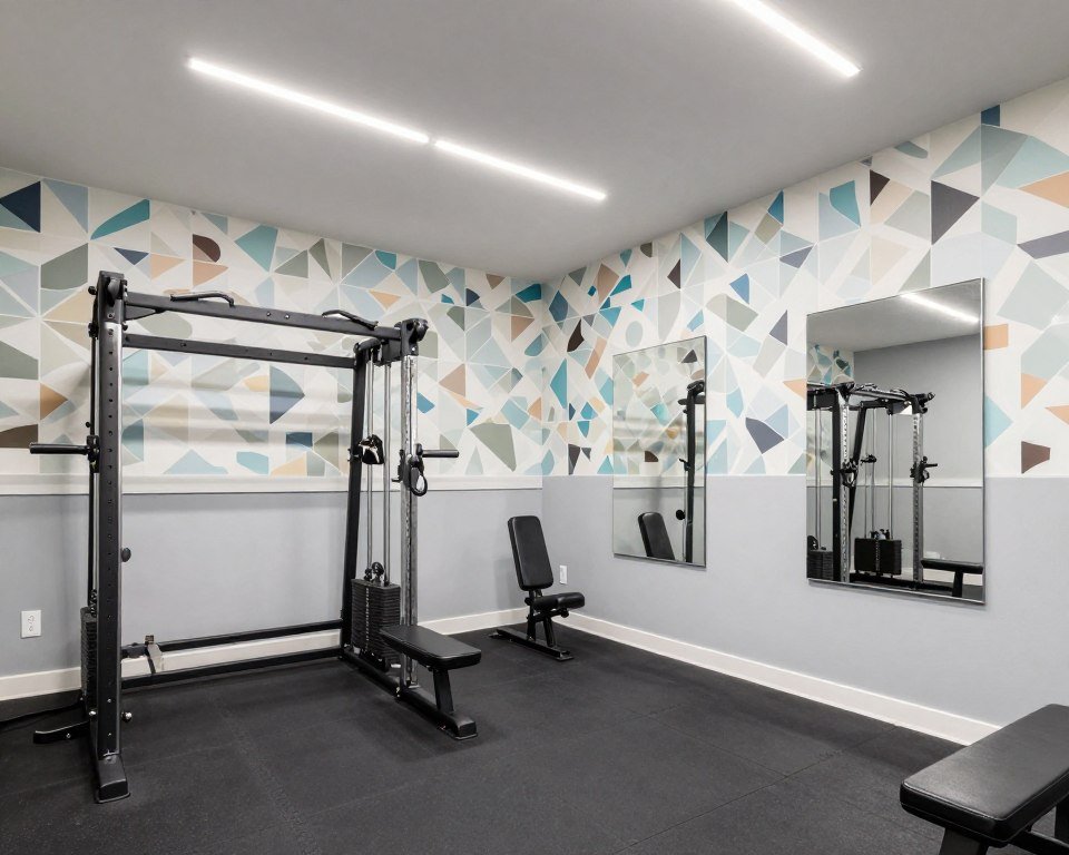
Accent Wall Focus

Not every wall in a room needs the half treatment. Creating one accent wall delivers maximum impact with minimal commitment.
This approach works brilliantly behind beds, sofas, or dining tables. The featured wall draws attention while other walls remain simple.
Starting with a single accent wall lets you test the technique. You can always expand to additional walls if you love the result.
Choosing the Right Wall
Selecting which wall receives the half wallpaper half paint treatment determines the room’s entire visual flow. Consider these factors carefully before committing.
- Identify the natural focal point where eyes land when entering the room
- Select the wall opposite the main entrance for maximum first impression impact
- Choose the wall behind your largest piece of furniture to create a framed effect
- Avoid walls with multiple windows or doors that interrupt the design flow
- Consider walls with the best natural lighting to showcase wallpaper texture and detail
- Test your choice by holding fabric samples against different walls before purchasing materials
Professional Installation Tips

Achieving professional results requires careful planning and proper technique. The right tools and methods make the difference between amateur and expert finishes.
Preparation accounts for much of your success. Taking time to measure accurately and prepare surfaces ensures long-lasting beauty.
Following a systematic approach prevents common mistakes. Each step builds on the previous one for flawless execution.
Step-by-Step Process
Step 1: Planning
Measure your room carefully and decide on the division height. Mark a level line around the entire room using a laser level or chalk line for accuracy.
Step 2: Surface Prep
Clean walls thoroughly and repair any damage. Sand rough spots and apply primer if needed. Proper preparation ensures adhesion and smooth finishes.
Step 3: Wallpaper Application
Apply wallpaper to the designated section first. Start from a corner and work systematically. Smooth out bubbles and trim excess at the division line.
Step 4: Painting
Once wallpaper is completely dry, apply painter’s tape along the division line. Paint the lower section with your chosen colour using quality brushes and rollers.
Step 5: Detail Work
Remove tape carefully while paint is slightly damp. Touch up any imperfections. Consider adding chair rail or trim at the division for a polished look.
Step 6: Final Inspection
Allow everything to dry completely. Inspect the division line for any gaps or issues. Make final touch-ups for a seamless, professional appearance.
Common Mistakes to Avoid
Timing Matters: Never paint before wallpaper is completely dry. Moisture from fresh wallpaper paste can cause paint to bubble or peel. Wait the full recommended drying time specified by your wallpaper manufacturer.
- Skipping the level check results in crooked lines that become more obvious over time
- Using cheap painter’s tape leads to paint bleed under edges and messy division lines
- Applying too much wallpaper paste causes bubbles and extended drying time
- Painting over uncleaned walls reduces adhesion and shortens the lifespan of your finish
- Removing tape after paint is fully dry risks pulling off dried paint along the edge
- Not accounting for pattern repeat in wallpaper leads to purchasing insufficient materials